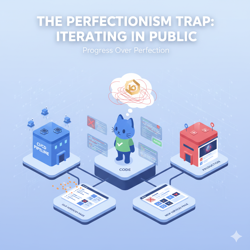
The Perfectionism Trap: AI, Animations, and Iterating in Public
The Perfectionism Trap: AI, Animations, and Iterating in Public
If you’ve ever built a website, you know the feeling: nothing is ever truly "done."
There is always a font that could be slightly more legible, a margin that’s off by two pixels, or a sentence that doesn't quite land. Over the last few days, I fell into the perfectionism trap. I found myself tweaking, adjusting, and sometimes obsessing over details that probably only I would notice.
But, thanks to the automation I set up earlier, I was able to push through the noise and ship some significant updates. Here is a look at what changed, what broke, and how I eventually got it right.
The Safety Net: Why CI/CD Matters
First, I have to give credit to the CI/CD pipeline (Continuous Integration/Continuous Deployment) I wrote about in my last post.
Usually, making constant "micro-adjustments" to a live website is terrifying. One wrong bracket and the whole site goes down. But because I have my automated linters and safety checks in place, I felt bold enough to experiment. I could try something, push it, see if it passed the tests, and deploy it within minutes.
It turned the stressful process of "updating production" into a smooth, iterative workflow.
The "Hero" Struggle: Me vs. Gemini
My biggest battle this week was the Hero section (the top part of the homepage). I had a vision: I wanted a cool, specific animation to greet visitors. Nothing too flashy, but something that felt modern and dynamic.
I leaned on Gemini to help me write the code for it. And to be honest? It was a struggle.
I spent hours going back and forth. I’d ask for an effect, paste the code, and... meh. It wasn't smooth. It wasn't the vibe. I found myself getting frustrated, trying to explain the visual in my head to a text-based AI.
The turning point? I stopped trying to force my original, vague idea. I took a step back, refined my request, and found a specific prompt that described exactly the motion and feel I wanted.
Behind the Code: The Winning Prompt
Here is the prompt that finally cracked the code. The key was moving away from generic requests like "make it cool" and focusing on the physics and libraries I wanted to use:
"Create a subtle, isometric data-flow animation using CSS keyframes and SVG. The motion should be slow, organic, and 'breathing' rather than bouncing or erratic. Use a particle effect that fades in and out to represent data transmission. Keep the code lightweight and responsive."
Suddenly, it clicked. The result is what you see on the homepage now—clean, professional, and exactly what I was looking for. Lesson learned: AI is a powerful tool, but it can only be as precise as the instructions you give it.
Cleaning Up the Clutter
While I was in the code, I took a hard look at the Services pages.
Originally, I relied heavily on bullet points. It’s the default for technical people—we love lists. But looking at it with fresh eyes, it felt cold. It looked like a grocery list of skills rather than a professional offering.
I stripped out the bullets and reorganized the content into distinct, structured sections. * It breathes better now. * It flows logically. * It allows the value of the services to stand out without getting lost in a wall of dots.
Progress Over Perfection
The website you see today is better than the one from last week, but probably not as good as the one next month. And that’s okay.
The goal isn't to launch something perfect; the goal is to launch something good and keep making it better. Thanks for following along with the changes.
Now, I’m going to stop tweaking the CSS and actually get back to work.
Comments (0)
No comments yet. Be the first to share your thoughts!